The handwriting of Baekje
The handwriting of Baekje
Posted June. 22, 2018 07:42,
Updated June. 22, 2018 07:42
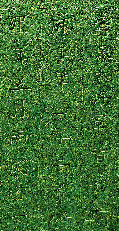
The “Memorial Stone of King Muryeong” (year 525, National Treasure No. 163) that was excavated at the Royal Tomb of King Muryeong is a precious data that allows us to understand the characteristics of the people of Baekje. The free, gentle and irregular trait innate to the Korean people can be seen in distinctively natural handwritings that were inscribed as the knife led. The overall elegant, soft, glossy and slick handwriting is noble. The number of words in each line is inconsistent and there is a difference in the size of the words. The vertical space between the words are also different: it is a square style of writing where tittles and strokes are not standardized with large spaces between the lines. Rules on sentences is also not standardized overall as the centerline of words of each line is inconsistent. The individuality and freedom of each word is emphasized but at the same time organically connected, making it natural with the beauty of uniformity in harmony with order.
The memorial stone of King Muryeong was influenced by China but when taking a look at the “Seven-Branched Sword” that was made in Baekje and sent to Japan, the writings on some 500 remaining wooden tablets, the handwritings of Baekje was elegant and pure even before it was influenced by China. After Baekje, the Chungcheong and Jeolla provinces demonstrated elegant, pure and smooth handwritings, which imply that this sort of handwriting is a strong trait of this region. The Chinese handwriting may be elegant yet is not pure and may be sophisticated yet is not natural. Baekje’s roofend tiles are cheerful and glossy, its earthenware round with soft lines, and its statue of the Buddha milder and gentler than Goguryeo and Silla.
The handwriting of Baekje differs from that of Goguryeo and Silla in that it is smooth, gentle and sophisticated, with wide space between words and lines, and written slowly. The smooth line of the letters means purity and gentleness and the wide space between words means outgoing characteristic and fast adaptation to a new environment. The wide space between lines show a careful and considerate personality while the slowly written letters mean slow judgment.